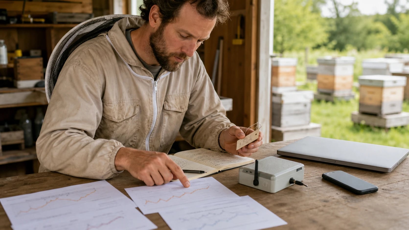
 AI-generated
Data Analysis for Beekeepers: Spotting Trends and Making Better Decisions
Which metrics really matter, how to spot trends in your bee data, and why data-driven beekeeping delivers better results.
Beekeepers have been gathering experience for centuries — through observation, intuition, and the wisdom of elders. But experience alone has blind spots: we remember the extraordinary (the swarm, the record harvest) and forget the mundane (the gradual decline of a colony over three months). Data doesn't forget. Those who systematically document and analyze their bee colonies recognize patterns that escape intuition — and make better decisions.
Why Data Matters in Beekeeping
Beekeeping is a system with many variables: weather, forage, colony strength, queen quality, varroa infestation, location, genetics, management practices. These variables interact — and that's exactly what makes it so hard to make the right decisions.
Data analysis helps you with three things:
- Recognize: What is happening right now? Which colonies are doing well, which aren't?
- Understand: Why is it happening? Which factors correlate with good or bad outcomes?
- Predict: What will likely happen? And what can you do to influence the outcome?
The Most Important Metrics
Not every number is equally important. We focus on the metrics that actually influence your decisions.
Colony Strength Throughout the Season
Colony strength (measured in frames of bees) is the most important indicator of a colony's performance. A strong colony collects more, survives winter better, and is healthier.
What you want to see: A curve that rises steeply in spring, peaks at the main nectar flow, and drops in a controlled manner in autumn. Deviations from this pattern indicate problems.
Action triggers:
- Colony under 4 frames in May: combine or strengthen
- Colony over 10 frames with swarm cells: swarm prevention
- Sudden decline: queen problem or disease
Varroa Infestation Trend
The varroa mite is the most important bee pest in temperate regions. The infestation trend over the season shows whether your treatment strategy is working.
| Timepoint | Acceptable Level | Warning Threshold | Critical |
|---|---|---|---|
| April (before drone brood) | <1 mite/day (nat. drop) | 1–3 mites/day | > 3 mites/day |
| June (after swarming) | <3 mites/day | 3–10 mites/day | > 10 mites/day |
| July (before harvest) | <5 mites / 100 bees | 5–10 / 100 bees | > 10 / 100 bees |
| September (after treatment) | <0.5 mites/day | 0.5–2 mites/day | > 2 mites/day |
| December (after winter treatment) | <50 mites total drop | 50–200 mites | > 200 mites |
Trend analysis: Compare the infestation trend across multiple years. Is infestation rising despite the same treatment? Then the timing, the product, or the application isn't right — or reinvasion from neighboring apiaries is too high.
Harvest Yield Per Colony and Location
Harvest yield is the result of many factors. Viewed over multiple years, patterns emerge:
- Location quality: Location A consistently produces 20 kg, Location B only 12 kg — Location A has better forage
- Colony performance: Colony 3 produces 30% more than average every year — the genetics are above average
- Year comparison: 2024 was a record year (avg. 28 kg), 2025 significantly weaker (avg. 18 kg) — weather-related
- Forage type: Summer honey stagnates, forest honey increases — forage shift at the location
Overwintering Rate
The overwintering rate (proportion of colonies surviving winter) is the most important long-term indicator of your management quality.
- Over 90%: Very good — your management is working
- 80–90%: Acceptable — optimization potential in treatment or feeding
- Under 80%: Problematic — systematic root cause analysis needed
Correlation analysis: Compare the overwintering rate with varroa infestation in autumn, food weight in November, and queen age. Often a clear connection emerges.
Queen Performance
Queens are the heart of the colony. Tracking their performance helps with breeding selection:
- Laying performance: Closed brood pattern vs. spotty
- Temperament: Calm on the comb vs. aggressive
- Swarming tendency: Does the colony repeatedly try to swarm?
- Yield: Average harvest from colonies with this queen line
Spotting Trends: The Method
Step 1: Record Regularly and Completely
Data analysis starts with data collection. Incomplete or irregular data produces skewed results.
Minimum data points per inspection
This sounds like a lot, but in a good app it's captured in 30 seconds — especially with voice input.
Step 2: Compare
A single data point has little value. Value comes from comparison:
- Colony over time: How has Colony 7 developed from April to September?
- Colony vs. colony: Why does Colony 3 produce twice as much honey as Colony 8?
- Location vs. location: Which location delivers the best results?
- Year vs. year: Was 2026 better or worse than 2025?
Step 3: Look for Correlations
Correlation isn't causation — but it provides clues. Examples:
Observation: Colonies with queens under 2 years old overwinter significantly better. Possible cause: Younger queens lay more winter bees. Action: Replace queens every 2 years.
Observation: Location B always has higher varroa infestation than other locations. Possible cause: High bee density in the region, strong reinvasion. Action: Start treatment at Location B earlier.
Observation: Colonies that drop below 6 frames in August rarely survive winter. Possible cause: Too few bees for an adequate winter cluster. Action: Combine weak colonies in August rather than letting them overwinter alone.
Step 4: Test Hypotheses
The most exciting phase: you derive a hypothesis from the data and test it next season.
"If I start varroa treatment 2 weeks earlier, infestation in September drops by 30%."
Next season: treat half the colonies early, the other half at the usual time. Compare at the end. This isn't an academic experiment — it's pragmatic beekeeping based on data rather than gut feeling.
Which Tools Help?
Beekeeping Software as Data Hub
Specialized beekeeping software like Hivekraft automatically collects your data in a structured database. You record inspections, treatments, harvests, and feedings — the software connects everything and provides analysis:
- Health Score: A composite health indicator per colony
- Swarm risk: Calculated from colony strength, queen age, queen cells, and season
- Varroa forecast: Projection of infestation based on your counts
- Location comparison: Average harvest, overwintering rate, colony development per location
- Queen ranking: Which queen lines deliver the best results?
IoT Data as a Supplement
If you have a hive scale, the data base becomes even richer. The weight curve combined with your inspection data and weather data creates a comprehensive picture that would never be possible manually.
Example: You see in the weight curve that Colony 4 stops bringing in nectar on June 15 — two weeks before the other colonies at the same location. In the inspection a week earlier, you had noted: "Colony strength declining, 6 frames." The combination shows: the colony is too weak to fully exploit the summer nectar flow. The cause was an older queen with declining laying performance.
Avoiding Common Analysis Mistakes
- 1
Mistake 1: Too few data points
You can't derive anything from 3 inspections per season. At least 8–10 inspections per colony over the season are needed to spot trends. With quick checks, this is manageable.
- 2
Mistake 2: Correlation = Causation
"My best colony stands next to the pear tree, so the pear tree provides the most forage." Maybe — or the colony simply has the best queen. Always control for other variables.
- 3
Mistake 3: Survivorship Bias
You only analyze colonies that survived and forget those that died. The dead colonies are just as instructive — perhaps even more so.
- 4
Mistake 4: No Baseline
Without a reference value, every number is meaningless. "18 kg harvest" — is that good or bad? Always compare with the average of your operation, your location, and your region.
- 5
Mistake 5: Changing too many variables at once
If you simultaneously change the location, try a new management approach, and swap the queen, you won't know at the end what made the difference.
AI-Powered Analysis: The Next Level
Traditional data analysis shows you what happened. AI-powered analysis goes a step further and tells you what will likely happen.
Concrete use cases:
- Daily briefing: "Good foraging conditions today at Location A. Colony 7 has high swarm risk. Varroa treatment at Colony 12 is due in 3 days."
- Anomaly detection: "Colony 9 shows atypical weight trend — 15% below the location average. Recommendation: Look more closely at the next inspection."
- Optimized treatment planning: "Based on the current infestation trend and weather forecast: ideal time for formic acid treatment is July 28 (3 dry, warm days)."
Hivekraft integrates such AI-powered analyses in the Intelligence module. The algorithms learn from your data and become more precise with each season. The daily briefing summarizes the most important action recommendations — like a personal beekeeping advisor based on your own data.
Data Culture in the Beekeeping Association
Data analysis becomes even more valuable when multiple beekeepers at the same location compare their data. In beekeeping associations, regional patterns can be identified:
- Shared forage calendar based on scale data
- Regional varroa infestation map
- Location assessment for new members
- Experience exchange based on data rather than anecdotes
Encourage your members to use a common beekeeping software. Just 5 beekeepers with hive scales in the association's area provide valuable regional forage data — knowledge that benefits everyone.
Conclusion: Data Doesn't Replace Experience — It Complements It
Data analysis in beekeeping is not an end in itself and not a substitute for experience. But it's a powerful tool that uncovers blind spots, makes patterns visible, and puts decisions on a more solid foundation.
You don't need statistics knowledge or an Excel diploma. You need regular documentation (30 seconds per colony is enough), software that structures and analyzes your data, and the willingness to adjust your management based on the results.
The first step: start this season documenting every inspection completely. At the end of the year, you'll see patterns you hadn't noticed before — and make better decisions next year.
Hivekraft offers the analysis tools you need — from simple location comparisons to AI-powered recommendations. Start with the demo and see what four years of beekeeping data looks like when properly analyzed.
Automatic Alerts: Never Miss Problems at the Beehive Again Goodbye Excel: Why Digital Hive Records Are the Future Discover Hivekraft: Get to Know All Features in 10 Minutes- Advanced Beekeeping -- Lesson 9: Data-driven decisions
- Digital Beekeeping with Hivekraft -- All features in 10 lessons
Less paperwork. More time with your bees.
Hivekraft is free for up to 10 hives. Register in 30 seconds.